Clarifying Style and Credentials for an Interior Design Studio
CANVAZ · WEB REDESIGN
PROJECT OVERVIEWCanvaz is a premium interior renovation studio known for its precision in cabinetry and finishes. However, their website didn’t reflect that same level of quality. I led a full redesign to rebuild trust and bring the digital experience in line with the care they deliver offline.
While the initial scope focused on visual cleanup, the project quickly expanded as deeper UX and content issues surfaced - leading to a full structural overhaul centered on clarity, credibility, and conversion.
DeliverablesYEARTOOL· UX audit
· Information Architecture
· Visual System & Hierarchy
· UI Redesign
June 2024
· Figma
· Photoshop
roleSole Designer
ChallengeS as a sole designerI had to figure out why users didn’t trust the site and rebuild that trust from the ground up. With no one to scope or prioritize alongside me, I made the call on what stayed, what changed, and what disappeared.
That meant defining:
⟡ What content users should see first (and what was getting in their way)
⟡ How to structure the experience for clarity and ease
⟡ How to visually communicate the same precision the studio brings to its interiors
USER researchTo understand what was breaking trust, I interviewed 10 homeowners (ages 30–60) who matched Canvaz’s target clientele. I asked them to walk through the site as if they were seeing it for the first time, then simply observed what made them pause, hesitate, or leave.

In short, the site wasn’t just under-designed,
it was undermining trust.
PROBLEM iInconsistent brand value on the landing page

The homepage didn’t reflect the quality and attention to detail that Canvaz delivers in its physical work. The design felt fragmented and unprofessional, which negatively impacted users' first impressions of the brand.
Overuse of font styles (5+) and font sizes (8+) disrupted visual consistency
Cluttered layout distracted from core content like services and portfolio
PROBLEM iiPoor navigation and information architecture
Users couldn’t easily access key information. The navigation was unintuitive, and broken links made it harder for visitors to understand Canvaz’s offerings - ultimately hurting user trust.
Main links like “Service” and “Login” were non-functional or irrelevant
Important sections (e.g., portfolio, contact) were buried or hard to locate
PROBLEM iiiDistracting and unprofessional external elements
Instead of supporting the brand, some elements actively harmed it. A misplaced QR code confused users and reduced the site’s perceived professionalism.
Random QR code lacked context and purpose
The elements clashed with the brand’s premium image and lowered credibility
SOLUTION I“Let the work speak first”
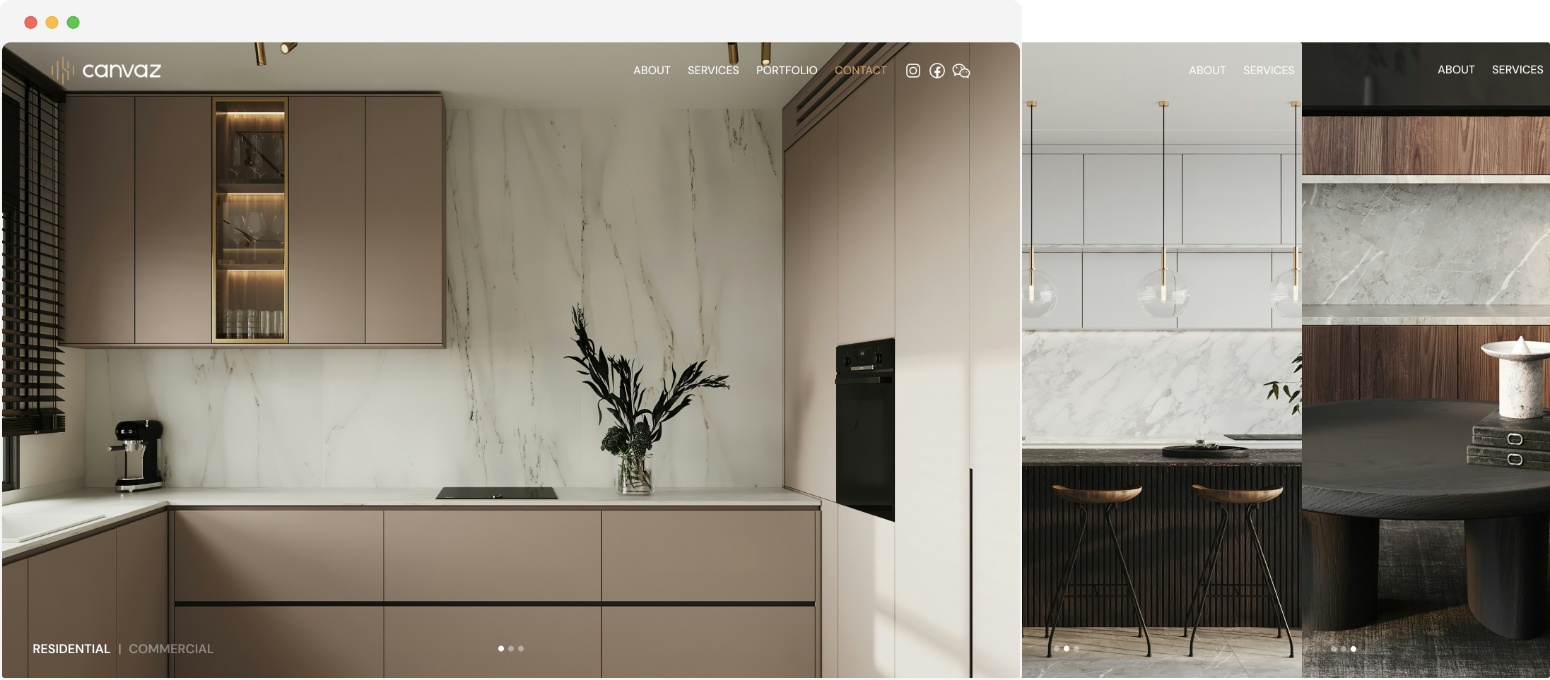
Rather than relying on words, showcasing the actual work upfront builds trust with today’s customers. In industries like interior design, where visual appeal is key, letting the work speak for itself is far more convincing than mere descriptions.
SOLUTION II“Navigation should never be a barrier”

I restructured the menu to prioritize clarity and speed. Key sections like Portfolio, Services, and Contact became easy to find and reducing friction.
SOLUTION IiI“Professionalism is key to trust”

External elements, such as the "Powered by Juicer" badge and QR code, were removed to create a cleaner, more professional design. This helped to refocus the user's attention on the core service offering, elevating the brand’s trustworthiness and aesthetic appeal.